You don’t need a designer, a domain strategy or a free weekend. You need about a dozen good pictures, two short paragraphs about yourself and a way for people to reach you. Here’s how to put that together, step by step.
The short version
- Pick 10 to 20 of your strongest, most recent works. Fewer is better than more.
- Photograph or export each one properly: straight, evenly lit, colours true.
- Give every work a title, a year and a one-line caption.
- Write a short About page in the first person, and add a contact form.
- Choose a simple layout that puts the work first, publish, and share the link.
Why a website, when you already have Instagram?
Social media is great for being found. It’s not great for being looked at. Your paintings get cropped to a square, sandwiched between a friend’s lunch and an ad, and pushed down the feed within a day. Nobody can see the last three years of your work in one place.
A portfolio website is the opposite. It’s calm, it’s yours, and it shows exactly what you choose, in the order you choose. When a gallery, an art director or a client asks “do you have a website?”, this is what they mean. They want one link where they can see your best work in two minutes and then get in touch.
Keep your social accounts. Just make sure they all point to the one place you control. (We go deeper into this in Instagram vs a portfolio website.)
What a simple portfolio needs (and what it doesn’t)
Most portfolio sites that work well have the same four parts. Anything beyond this is optional, and most of it is a distraction.
- Your name, big and clear at the top. Not a logo, not a clever studio name you’ll regret in two years. Your name is what people will search for.
- The work, front and centre. Ideally it’s the first thing people see, with no welcome text or slideshow in the way.
- A short About page with a few sentences and, if you like, a photo of you or your studio.
- A way to get in touch. An email address or a simple contact form.
What you can safely leave out: a blog you won’t update, a “services” page, a news section, sliders, music, a visitor counter and pages that say “coming soon”. Each one is another thing to keep up to date, and an empty blog looks worse than no blog.
Step 1: Choose your work
This is the hardest step, and the one that matters most. People judge a portfolio by its weakest piece, not its strongest. Twelve great works will always beat forty good ones.
Here’s a simple way to do it:
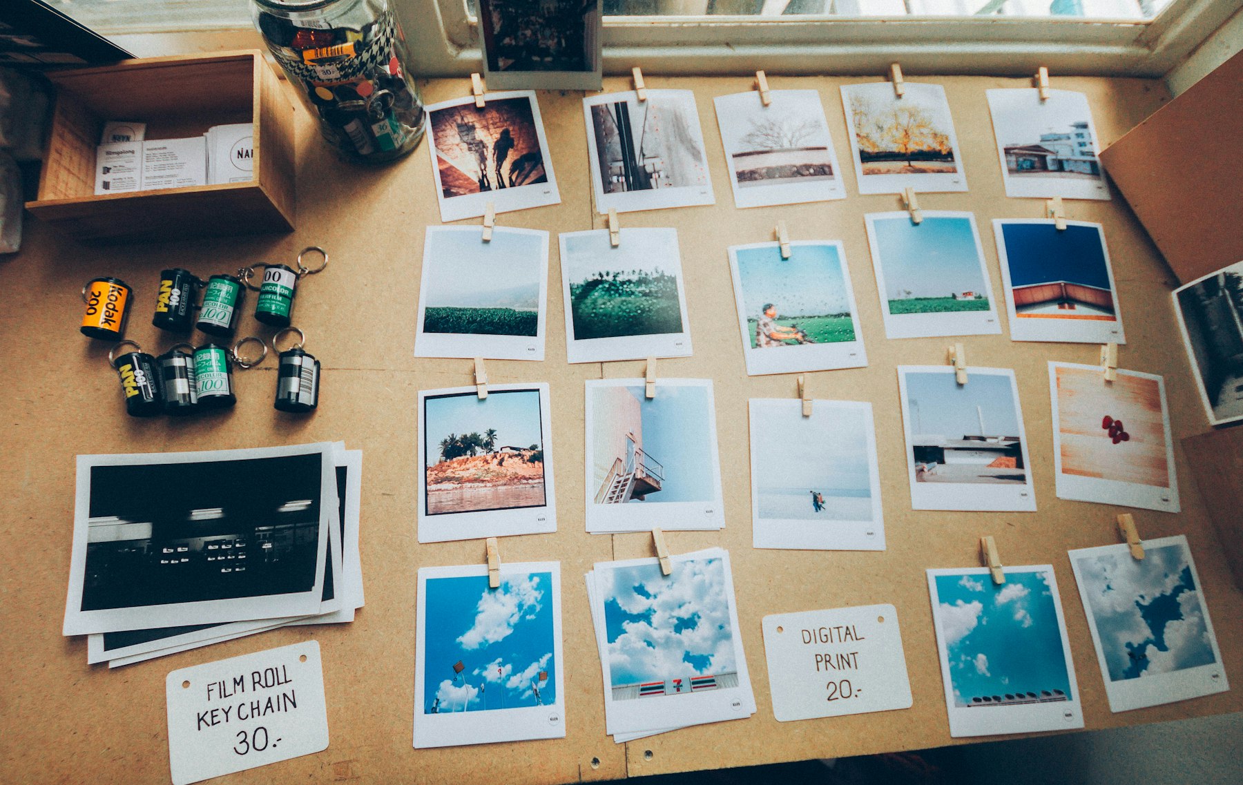
- Gather everything from the last two or three years into one folder. Don’t judge yet.
- Pick the pieces you’d be proud to show a stranger. Be honest. If you have to explain why something is in there, it probably shouldn’t be.
- Choose a direction. Keep the work that looks like the work you want to be asked to do. If you want more portrait commissions, show portraits, not logos.
- Cut to 10–20. If you do several kinds of work, group them into two or three series (“Paintings”, “Illustration”, “Sketchbook”) rather than mixing everything into one pile.
- Put your best piece first and your second-best last. People remember beginnings and endings.
Still stuck? Ask a friend who doesn’t know your work to pick their five favourites. Whatever they skip, think hard about.
Step 2: Get good images of it
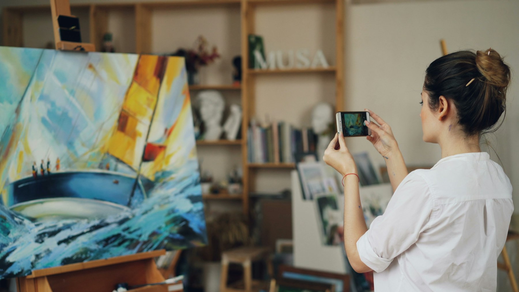
A great painting in a bad photo looks like a mediocre painting. You don’t need a professional camera, but you do need to get a few basics right:
- Even, soft light. Daylight from a window on a cloudy day is perfect. Avoid direct sun and the ceiling light, which leaves glare and yellow tints.
- Straight on. Hold the camera level with the centre of the work, so the edges come out as a rectangle, not a trapezoid.
- Crop to the edges of the work (or keep a thin, even border). Delete the easel, the wall and your feet.
- Check the colours against the real thing, side by side, and adjust until they match.
We wrote a whole guide on this: how to photograph your artwork with a phone. Digital artists and photographers have it easier. Export JPGs about 2,500 to 3,000 pixels on the long side, in the sRGB colour profile, so they look the same in every browser.
Step 3: Write the few words you need
You don’t need to be a writer. You need three small pieces of text, and short is better for all of them.
Titles and captions
Give every work a title, a year and, where it helps, the medium and size: “Low Tide, 2025. Oil on linen, 60 × 80 cm.” A caption of one sentence about what’s going on is plenty. It helps people understand the work, and it helps search engines find it, because Google can’t see your painting but it can read your caption.
Your About page
Write it in the first person, like you’d introduce yourself at an opening. Three short paragraphs work well:
- What you make and where. “I’m a painter in Lisbon. I paint coastlines, mostly in winter, mostly from memory.”
- What drives the work, in plain words. Skip the art-school language. If your mum wouldn’t understand it, rewrite it.
- The useful facts. Recent shows, clients or publications, and what you’re open to: commissions, freelance work, gallery representation.
A photo of you or your studio makes it feel human. It doesn’t have to be professional. It just has to be you.
Contact
Make getting in touch effortless. A contact form or a plain email address, plus links to the one or two social accounts you actually use. If you take commissions, say so right there: “Open for commissions from March.”
Step 4: Pick a platform and a layout
You have three broad options:
- A portfolio builder made for creative work (Semirare, Format, Cargo, Adobe Portfolio). Quickest to set up and designed around images. This is the right choice for most artists.
- A general website builder (Squarespace, Wix). Flexible and good if you also need a shop or bookings, but you’ll spend longer setting it up.
- Building it yourself with WordPress or code. Total control, and total responsibility for updates, hosting and security.
If you’re not sure which one to pick, we compared a dozen of them in the best portfolio website builders for artists, including where each one is the better choice.
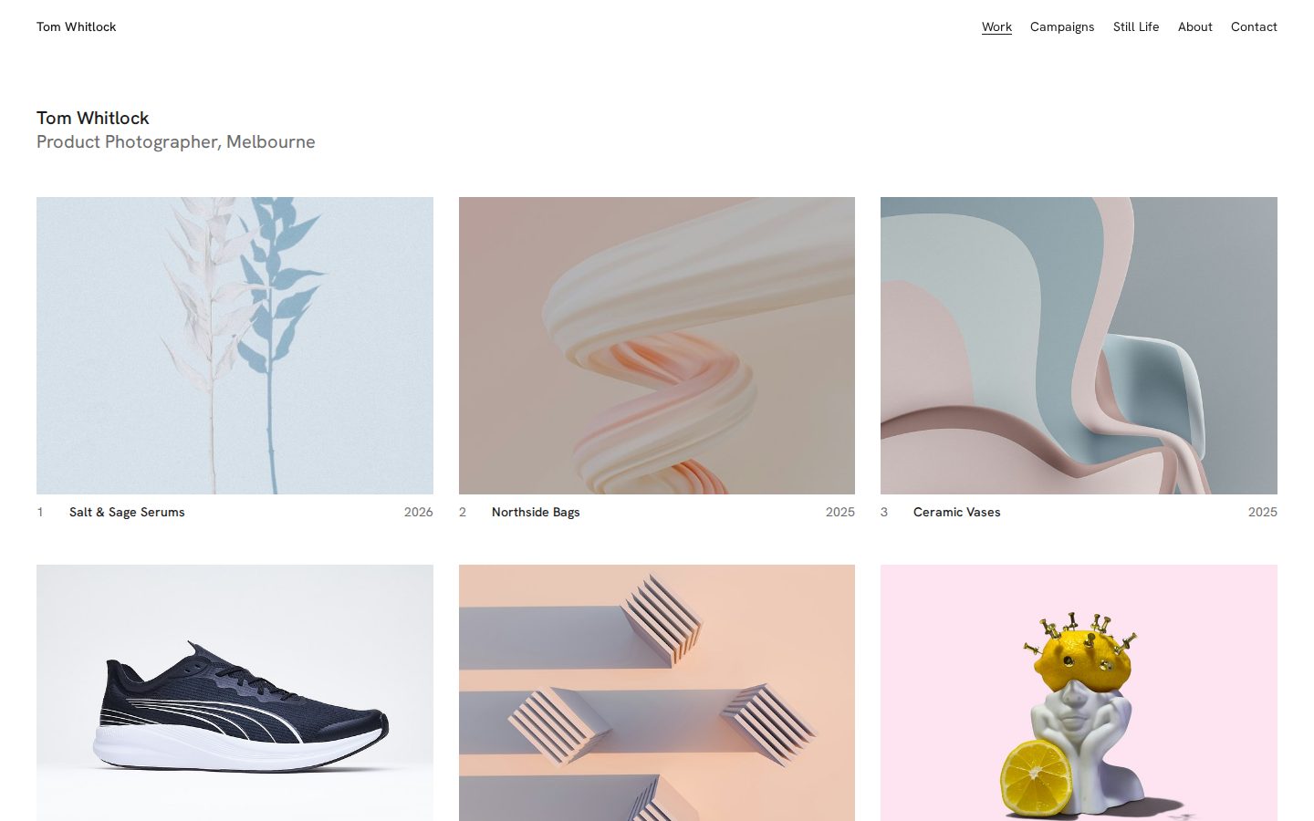
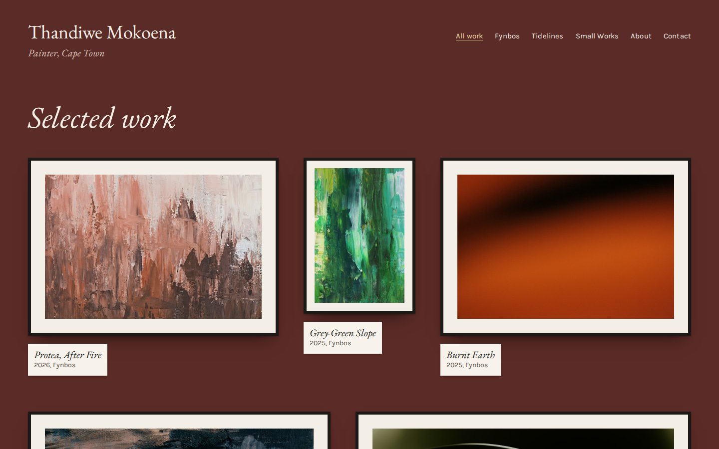
Whatever you use, choose a layout that stays out of the way. Look for plenty of white space, big images and simple typography, and a layout that looks good on a phone, because that’s where most people will first see your site.
Step 5: Publish, then share it properly
Don’t wait until it’s perfect. A simple site that’s live today beats a perfect one that’s still “almost ready” in March. You can always add work later.
Before you publish, check these:
- Open it on your phone. Tap every link. Send yourself a message through the contact form.
- Give the site a clear title, like “Ada Moreau, painter”. That’s what shows up in Google and when someone shares your link.
- Consider your own domain, like adamoreau.com. It costs about the price of a coffee a month, looks professional and stays yours forever, whatever platform you use. Here’s how to choose and set one up.
Then tell people. Put the link in your Instagram bio and email signature, on your business cards and at the bottom of every application. Search engines will find it on their own over the next few weeks.
Keep it alive. Put a reminder in your calendar every three months: add your newest good work and remove your weakest. Twenty minutes, four times a year, and your portfolio never goes stale.
Common mistakes (and quick fixes)
| Mistake | Fix |
|---|---|
| Showing everything you’ve ever made | Cut to your best 10–20. Leave people wanting more. |
| Blurry, skewed or yellow photos | Rephotograph by a window, straight on, and crop tight. |
| A welcome page before the work | Show the work first. Your name and a menu are enough of an introduction. |
| No titles or captions | Title, year, medium, one sentence. Good for people and for Google. |
| Hard to contact | Put a contact link in the menu of every page. |
| Last updated in 2022 | A quarterly 20-minute refresh. Put it in the calendar now. |
That’s really all there is to it. The artists with the best portfolios aren’t the ones with the fanciest websites. They’re the ones who edited hard, photographed well and made it easy to say hello.